My comments on Andrea’s Posts.
My comments on Hangyodon’s Posts.
My comments on Sekhon’s Posts.
I wonder if I put a few words here?
Choosing electives in university is one of those things that sounds simple but can actually get pretty stressful. That’s what my Twine story is about. It follows Rachel Green, a UVic student who’s trying to pick an elective that fits her schedule, sparks her interest, and doesn’t make her workload impossible. The decisions she faces are ones that I think a lot of us can relate to.
Here is link to Twine Story: https://raghavchadha23.github.io/twine/
Please see a few screenshots attached below:
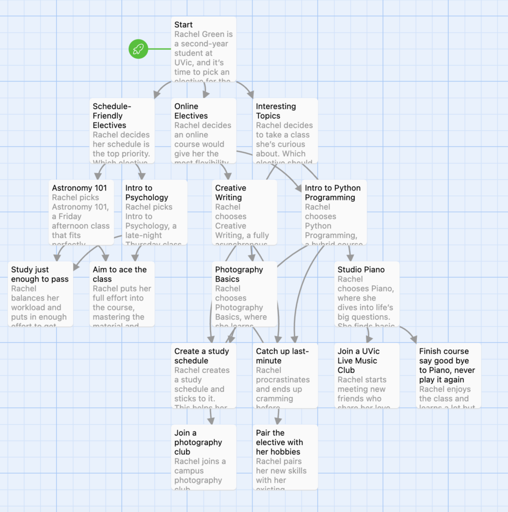
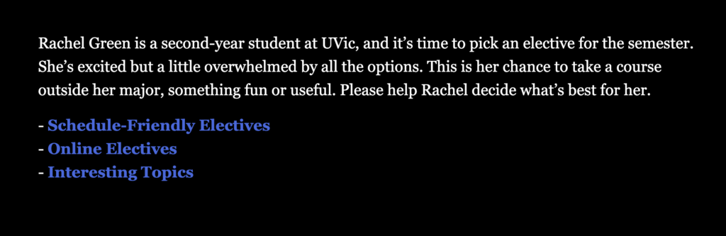
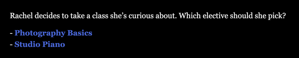
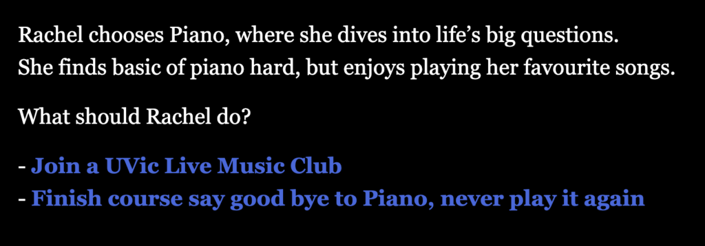
Creating this story was such a fun experience. Twine lets you map out different pathways, so Rachel’s choices feel real and impactful. For example, she might choose an online elective for flexibility but realize it’s harder to stay motivated, or pick an in-person class that fits her schedule but doesn’t match her interests. Every decision leads to a specific outcome, but all the paths still reflect the ups and downs of student life.
I wanted to make sure Rachel’s journey felt personal, so I added realistic dilemmas like balancing her workload or sticking with a topic she’s curious about. The process of crafting her story made me reflect on my own academic choices and how they’ve shaped my university experience. The process of creating the story deepened my understanding of how branching narratives can encourage active learning and foster critical thinking.
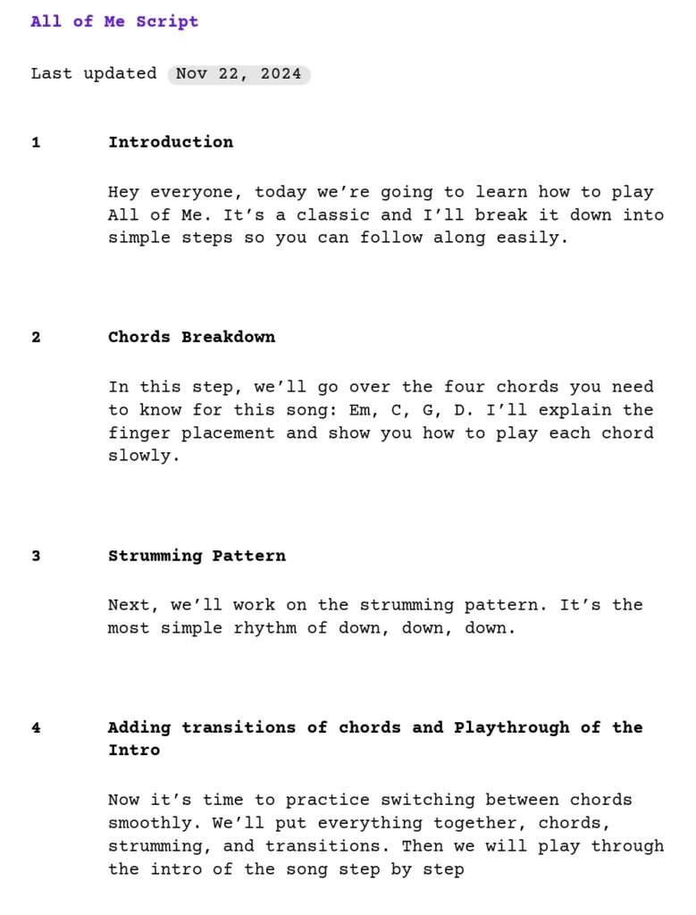
For the video, I created a beginner-friendly tutorial on how to play intro of All of Me by John Legend. It’s a song that’s fun to play and great for practicing both chords and strumming patterns.
I focused on keeping the lesson clear and simple, breaking everything down into small sections. This way, even someone picking up a guitar for the first time could feel confident following along. Using a conversational tone helped make the video feel approachable, and adding captions for the chords and strumming pattern ensured that the key points were easy to follow.
Here is storyboard below, I used Canva to make this story board.

Below is the script of the video:
Please see the video attached below of tutorial of Intro of song “All of Me” by “John Legend”.
Creating Rachel’s Elective Twine story and the video for Guitar Intro All of Me by John Legend was such a rewarding experience. With Twine, I learned how interactive storytelling allows users to immerse themselves in decision-making, which makes the whole experience more engaging and relatable.
Writing Rachel’s story reminded me of how small, everyday choices can impact our academic and personal lives, a lesson that’s so easy to connect with as a student.
The Segmenting Principle helped me break the tutorial into clear steps: introducing the song, teaching the chords, and demonstrating the strumming (just simple downstrokes for beginners!). The Signalling Principle was crucial too, with chord pictures and text.
Finding the right angle to show the chords clearly was a bit of a headache as I had to adjust the camera multiple times to get the perfect shot. Editing was also a slow process. I felt screencasting was way easier than capturing the video.. Despite the challenges, it was super fun to teach a song that’s beginner-friendly and so well-loved.
Module 4 was all about creating learning materials that are not only visually appealing but also accessible to everyone. I created an infographic on How Music Enhances Mental Health, a topic that’s super close to my heart because music has been a huge influence in my life, both personally and academically. Music is more than just a hobby for me, it’s something that grounds me, lifts my mood, and helps me focus, so I wanted to share its mental health benefits in a way that anyone could enjoy and understand.
I chose to focus on music and mental health because music has played a major role in my life. Whether it’s studying, relaxing, or just needing a mood boost, music is always there. It’s one of those things that’s been both a passion and a practical tool for me. Creating an infographic on how music can enhance mental wellbeing felt like a meaningful way to blend my personal interests with the skills we’re developing in this course. I wanted to share something close to my heart while making sure that it was accessible and engaging for anyone, regardless of their background or abilities.
This module made me realize that accessible design principles aren’t just useful for assignments but are skills I’ll be using in my career and academic life as well. Knowing how to create content that everyone can access and benefit from is valuable no matter where I end up, whether it’s teaching, presenting, or designing projects. This module taught me to see accessibility as an essential part of design, not just an add-on, which is a mindset I plan to carry forward.
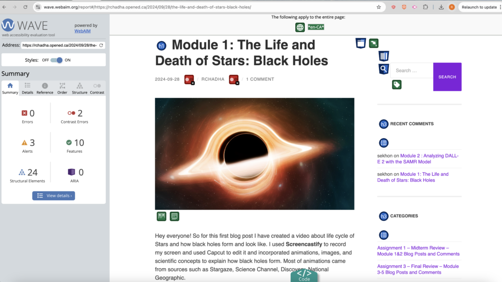
Running my Module 1 blog post through the WAVE tool was honestly pretty eye-opening. I’ve always thought about accessibility as important, but seeing these specific issues pop up, like the contrast errors, made me realize just how easy it is to overlook details that matter for accessibility. The skipped heading level and redundant title text were things I’d never really considered a big deal, but now I can see how they could throw off someone using a screen reader.
I thought the text looked fine, but the report pointed out that for some people, it might be tough to read. Now I know just because it works for me doesn’t mean it works for everyone. Honestly, using the WAVE tool showed me I’ve got some learning to do when it comes to accessible design. These aren’t huge changes to make, but they have a huge impact on making content more inclusive.

Trying out text-to-speech was a new experience for me, and honestly, it gave me a fresh perspective on how accessibility tools can make content more inclusive. This experience was also a bit of an “aha” moment for understanding how people who rely on text-to-speech might interact with my content. I used NaturalReader to listen to my blog post, and I was surprised by how different it felt to hear my words rather than read them. When the sentences were short and clear, it was easy to follow. It made me realize that overly complex sentences could make things harder for people who rely on these tools to “read” for them. Trying Natural Reader Software made me more aware of the impact of language choices and sentence structure, not just for accessibility but for making my content more engaging for everyone.
When creating my infographic on How Music Enhances Mental Health, I wanted it to be visually engaging while also following the accessibility principles we learned.
Contrast: I used bold, contrasting colors for section headings (Like white text on blue background or black text on white/blue background). It made each point easy to read and helped draw attention to key ideas, making the infographic more accessible for people with visual impairments.
Hierarchy and Alignment: I organized the infographic with clear headings for each benefit of music, such as “Elevate Your Mood” and “Improve Focus.” Each section followed the same layout: heading, description, and image. This helped in reducing cognitive load and making the content easy to follow.
White Space: I left plenty of white space between sections.
Repetition: I used the same font, color scheme throughout the infographic.
Color: I chose visually soothing colors to make the infographic calming and easy on the eyes.

Cognitive Load Theory and Segmenting: Each section is simple and direct, allowing the viewer to process one benefit of music at a time without feeling overwhelmed.
Redundancy Principle: I avoided unnecessary text, pairing each point with a single icon to keep it concise and clear.
Multimedia and Modality Principles: I combined icons with short text to convey ideas visually and verbally, making it easier to understand.
Signaling Principle: Bold certain important keywords like “Dopamine”, “Cortisol” etc., guiding viewers’ attention to key ideas.
This was a big shift in perspective for me. When designing the infographic, I kept thinking about who might be excluded if I didn’t pay attention to certain details like contrast.
I realize how crucial accessible design is and not just for assignments but for everything I create going forward. Using tools like WAVE and Text-to-Speech made me notice small tweaks, like improving contrast or keeping language simple, that actually make a big difference for inclusivity. I’m excited to apply these skills in both my personal and professional life to create content that’s truly accessible for all.
Have you ever really thought about what it means to be a “good person”? It’s more than just being polite or doing a random nice thing now and then; it’s about showing kindness, empathy, and integrity in your everyday actions. For this post, I put together a lesson plan on “How to Be a Good Person.” The goal was to bring in some design principles we’ve been learning, like backward design, constructive alignment, and Merrill’s First Principles of Instruction, to create a lesson that’s not only meaningful but actually sticks.
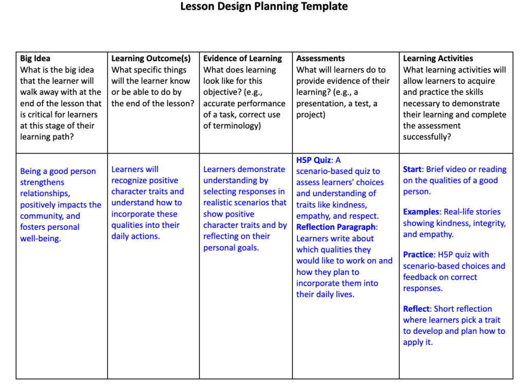
Backward design is pretty straightforward, it’s all about starting with the end goal in mind. I began by focusing on what I wanted people to walk away with i.e. a real understanding of what makes a good person and how to put those traits into action. Working backward from that, I created learning outcomes and activities that lead toward this goal. It made planning more organized, and I avoided adding random activities that didn’t serve the main purpose.
Constructive alignment was key in making sure every part of the lesson, whether it’s an activity or an assessment, connects directly to the goal. The interactive quiz reinforces an understanding of character traits by pairing each trait with a realistic scenario, and the reflection paragraph encourages learners to think about their own actions and how they can practice these traits. This way, every element in the lesson has a purpose, keeping it focused and meaningful.
Merrill’s First Principles are all about real-world application, and they shaped my approach in several ways:
To make this lesson on character development interactive, I created a decision-making quiz using H5P. In each question, learners are presented with a real-life scenario and asked to select the response that best demonstrates good character. For example:
Scenario:
You notice a classmate struggling with a heavy project bag on campus. What do you do?
Options:
Feedback:
By giving learners immediate feedback, they see how positive traits like kindness, empathy, and respect can be applied in real situations, helping them actively connect with the lesson.
Working on this lesson about character traits using the Principle of Learning Design and Active learning was eye-opening. It’s easy to think that teaching something like “being a good person” is straightforward, but I quickly realized that without a clear structure, it can easily feel vague… Now I know that active and passive learning play an important role, so in learning activities, I started with a breif intro and then designed an interactive H5P quiz to give learners a hands-on way to apply these ideas. Backward design showed me how focusing on the end goal from the start makes the lesson way more practical and achievable. Constructive alignment was another huge game-changer. Making sure each part, from the intro video to the examples and H5P quiz, lined up with the lesson’s goal gave the whole thing a clear purpose. Instead of just listing traits, learners get to see how they’d actually apply these qualities in real life, which I think makes a huge difference. It’s like, rather than just hearing about kindness, they’re actively thinking through it.
Seeing how these principles apply so directly, I feel like I’ve gotten a way deeper understanding of how powerful a well-designed lesson can be.
My Comments on Andrea’s Posts
My Comments on Hangyodon’s Posts
My Comments on Sekhon’s Posts
INTRODUCTION
In this blog, I’m going to explore DALL-E 2, an AI tool that creates images from text prompts, and see if it could be useful in an educational setting. I use ChatGPT every day to help debug my code, but I’ve never tried DALL-E before, so this is going to be a new experience for me. I’ll also be using ChatGPT to guide my analysis and applying the SAMR model to figure out if DALL-E 2 can actually enhance learning. Along with that, I’ll touch on some ethical concerns, like how AI might impact classrooms and what we should think about before bringing these tools into education.
Using DALL-E 2
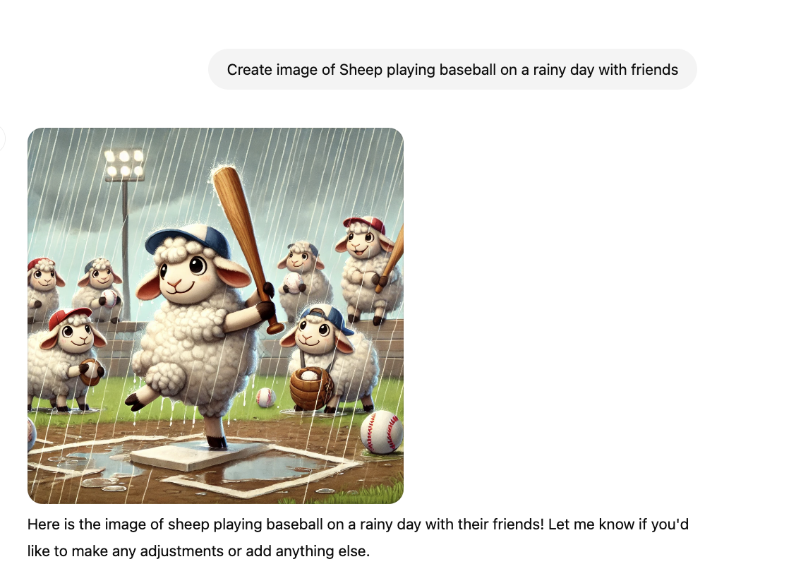
I wanted to test DALL-E 2’s creativity, so I gave it the prompt, ‘Sheep playing baseball on a rainy day with friends.’ The AI-generated image captured the whimsical scene quite well. Then, I tried another prompt: ‘ Dog winning Olympic gold in 100m sprint’ The result was equally amusing, with a dog winning Olympic gold on the podium. These kinds of images could be used in a creative writing or art class to inspire students to develop stories based on visual prompts. For students who might not be comfortable with drawing or painting, DALL-E 2 provides an accessible way to express creativity and engage with visual content in a way that feels more approachable.
Fig. 1 DALL-E 2 generated this image based on the prompt ‘Sheep playing baseball on a rainy day with friends.’
Fig. 2 DALL-E 2 generated this image based on the prompt ‘ Dog winning Olympic gold in 100m sprint.’
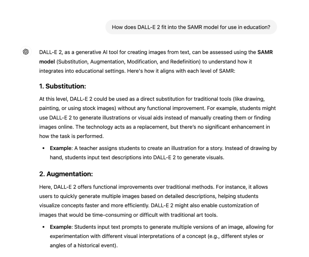
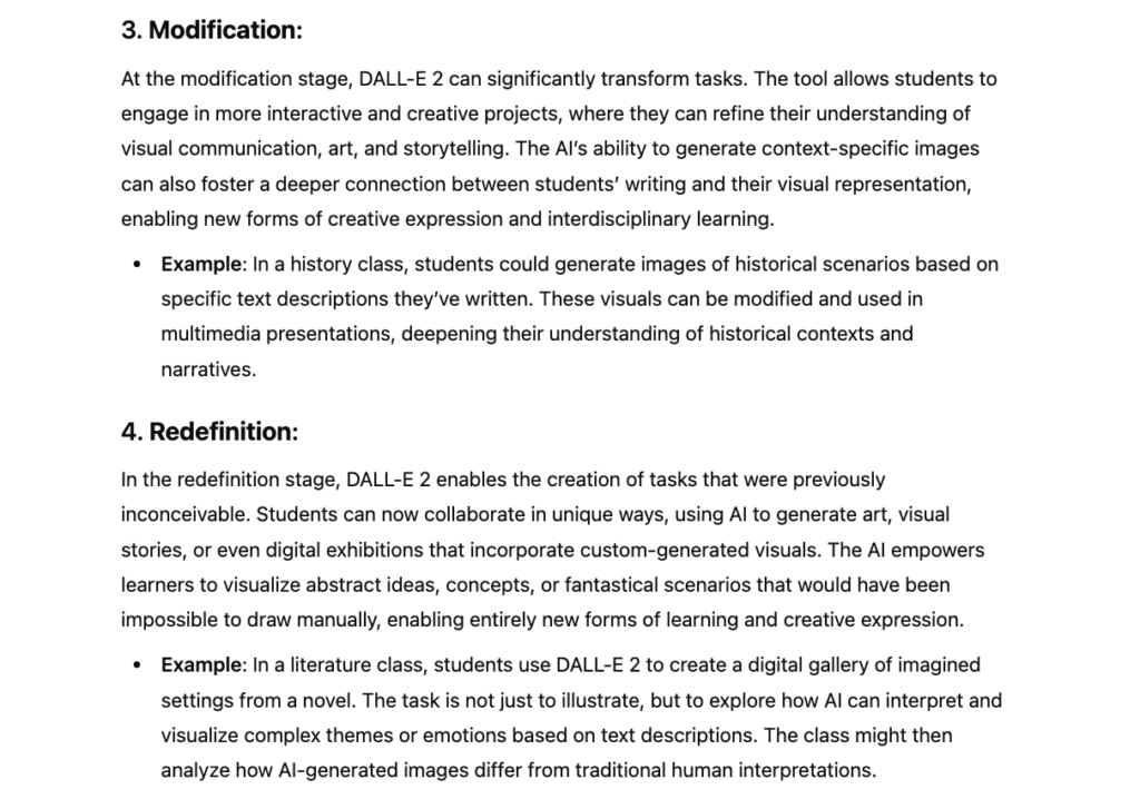
SAMR Model Analysis (with ChatGPT’s Help)
To help me better understand how DALL-E 2 fits into the SAMR model, I asked ChatGPT for a breakdown. ChatGPT explained how the tool could be used at each stage, from replacing traditional art supplies to redefining how students can engage with creative content in the classroom. Here’s the breakdown it provided:
Fig. 3 ChatGPT helped outline DALL-E 2’s fit within the SAMR model, guiding my analysis of its use in education.
After going through ChatGPT’s breakdown, I’ve got my own thoughts on how DALL-E 2 fits into education:
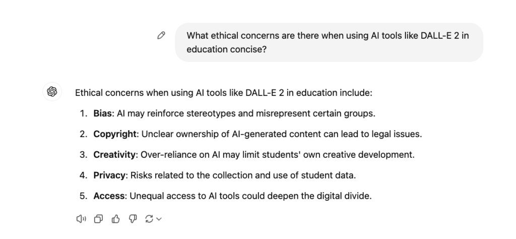
Ethical Considerations
I asked ChatGPT for a concise summary since I was getting too much unnecessary information at first. I just wanted the key points, so I typed “concise” to speed up the process, and it worked! Here’s what ChatGPT came back with, breaking down the major issues like bias, copyright, and privacy in a clear, straightforward way. It was pretty helpful, especially when I was looking to keep things simple.
Fig. 4 ChatGPT’s response explaining the ethical concerns of using DALL-E 2 in education.
Reflection
Using ChatGPT and DALL-E 2 for this assignment was actually pretty fun and eye-opening. Like, I didn’t expect DALL-E 2 to do such a good job with my random prompts like “sheep playing baseball on a rainy day.” It was super cool to see how it handled that. The way it generates images so quickly is something I can see working well in classrooms, especially in art or creative writing. It really speeds things up when you’re trying to come up with ideas.
One thing I noticed is that while DALL-E 2 makes things easier, there’s a risk of students relying too much on it and missing out on learning how to do things themselves. Like, it’s great for visuals, but what about developing actual drawing skills? Also, the ethical issues are pretty real like, I hadn’t really thought about how the AI might pull from copyrighted images or how bias in the dataset could sneak into the images. So yeah, while it’s an awesome tool, we have to be careful with how it’s used.
Conclusion
So, overall, I think DALL-E 2 is a super useful tool for learning, especially when it comes to making visual content. It’s really accessible for students who might not have the skills to draw or paint but still want to create something cool. It fits into the SAMR model pretty well, especially at the higher levels where it can redefine learning by allowing students to collaborate or create things they wouldn’t have been able to do by hand.
Looking ahead, it’s clear that tools like DALL-E 2 could play a big role in making education more interactive and creative.
Citations
“How does DALL-E 2 fit into the SAMR model for use in education?” prompt, ChatGPT, OpenAI, 12 Oct. 2024, chat.openai.com/.
“What ethical concerns are there when using AI tools like DALL-E 2 in education concise?” prompt, ChatGPT, OpenAI, 12 Oct. 2024, chat.openai.com/.
“Sheep playing baseball on a rainy day with friends” prompt, DALL-E, version 2, OpenAI, 12 Oct. 2024, labs.openai.com/.
“Dog winning Olympic gold in 100m sprint” prompt, DALL-E, version 2, OpenAI, 12 Oct. 2024, labs.openai.com/.

Hey everyone! So for this first blog post I have created a video about life cycle of Stars and how black holes form and look like. I used Screencastify to record my screen and used Capcut to edit it and incorporated animations, images, and scientific concepts to explain how black holes form. Most of animations came from sources such as Stargaze, Science Channel, Discovery, National Geographic.
I imagined the audience the class of EDCI 337, students from different programs and majority who might not be super familiar with black holes or life cycle of stars but are super curious about it.
As I applied Mayer’s principles, I realized how important it is to think about how people are going to absorb the information. I found the signaling and coherence principles pretty easy to implement, but redundancy was harder. I kept wanting to add extra text to explain things better, but I had to stop myself.
I found using screencastify and the video editor a tough task and I feel like I’ve got a better handle on how to design multimedia that actually helps people learn.
I’m a 4th-year Computer Science student at UVic. I’ve completed co-op terms in Toronto and Vancouver, gaining hands-on experience in software development. Outside of academics, I enjoy playing guitar, keyboard, and going to the gym which helps me stay creative and balanced.
As we begin our team collaboration, here’s a bit about me and how I work best so we can all crush it together:
© 2026 EDCI 337 – Raghav Chadha
Theme by Anders Noren — Up ↑

Recent Comments